The Problem Statement
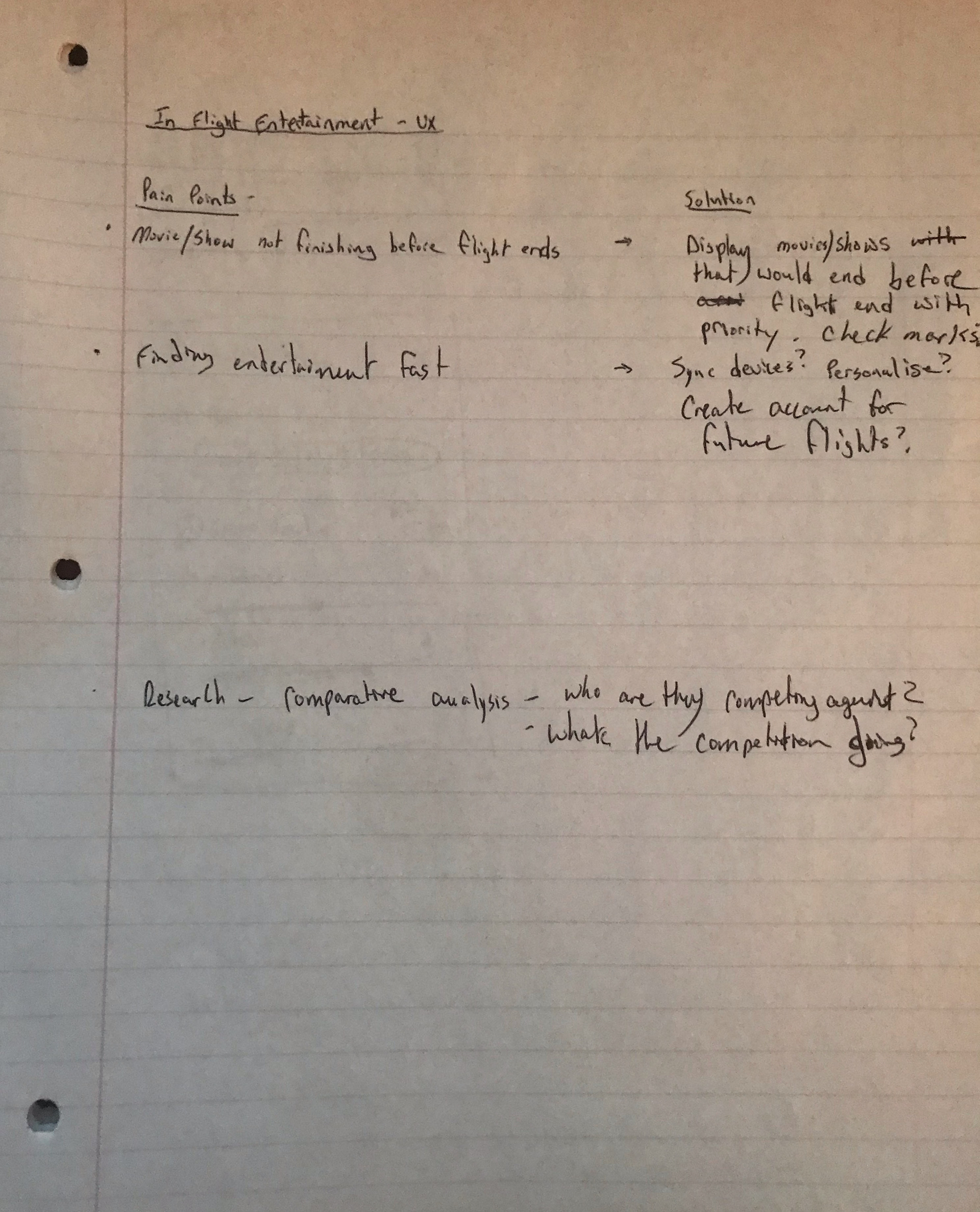
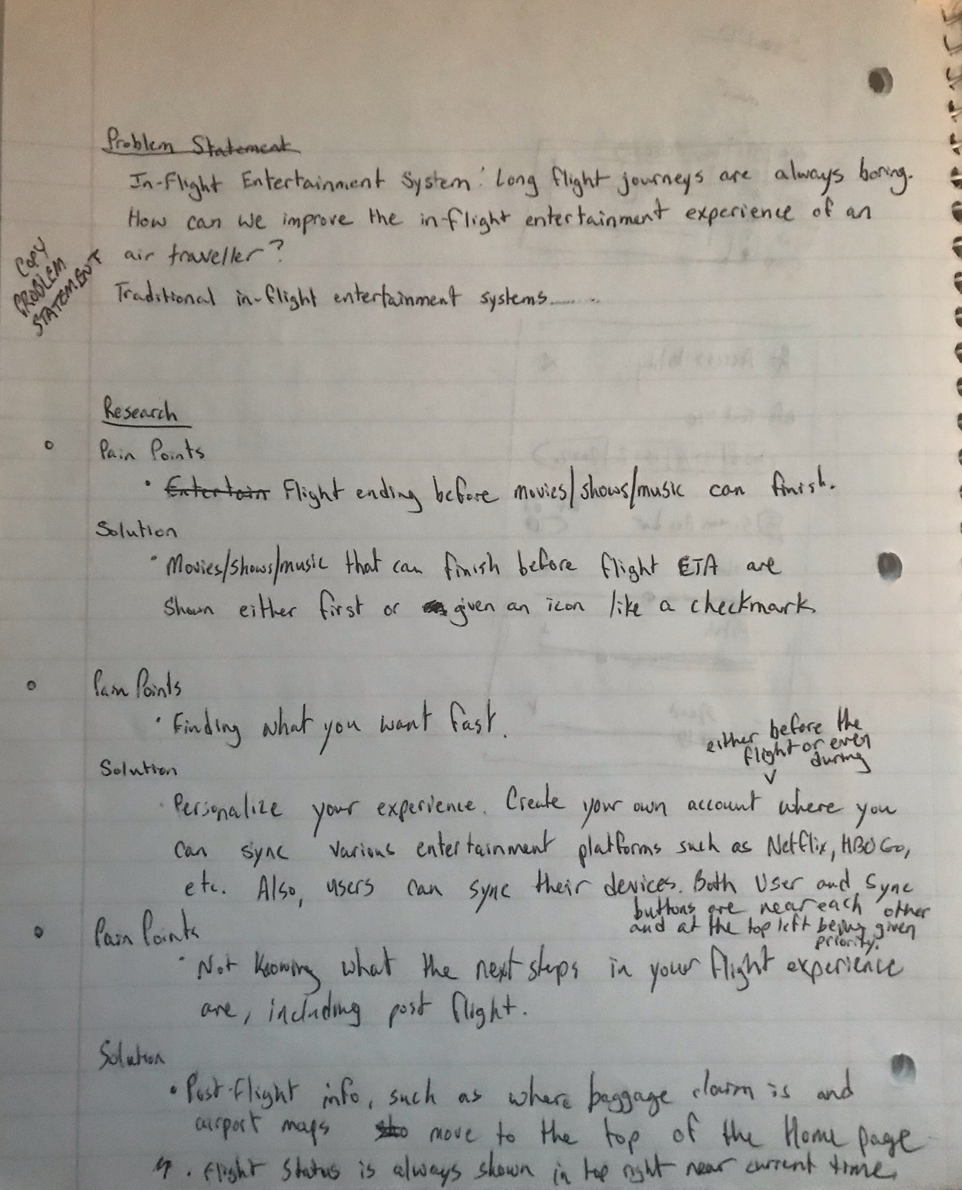
Long flight journeys are always boring. How can we improve the in-flight entertainment experience of an air traveller? Traditional in-flight entertainment systems have touch interfaces and provide movies, TV shows, music, games, on-board camera views, and real-time flight statistics. But the navigation is very difficult, and it has discoverability issues.
The Thought Process


The problem statement provided the information on who it was I was Empathizing with - the air traveller. After Defining the issues that needed to be resolved, it was time to Ideate! While it was not possible to speak to the users and pinpoint each of their pain points myself, I was able to pick out those pain points in the problem statement itself on top of some additional researching on the subject matter. As it turns out, there were already quite a number of pain points on this subject as well as various solutions. Aside from coming up with my own ideas, I also studied other people's ideas and compared them to my own. Thankfully, as it turns out, I was not only on the right track, but I thought up some unique ideas that I have not yet seen implemented anywhere else! With all the necessary information needed to begin working on a design, I began working on the Prototype! There is a reason there is only one final wireframe, and that is because I was challenging myself to create the simplest looking design that was also the most effective! I wanted everything to be right at the tip of a user's fingers! Remember, not every air traveller is tech-savvy! Unfortunately, there was no way to Test my prototype, as this was only an assignment; however, given the chance to put this before any frustrated air traveller, I would be thrilled! Well, what do you think?
The Solution
· Entertainment such as movies, TV shows, music, etc. don’t always finish before the flight ends. Entertainment that can finish before the flight’s estimated time of arrival will either be shown first in their respective lists or marked with an icon such as a checkmark.
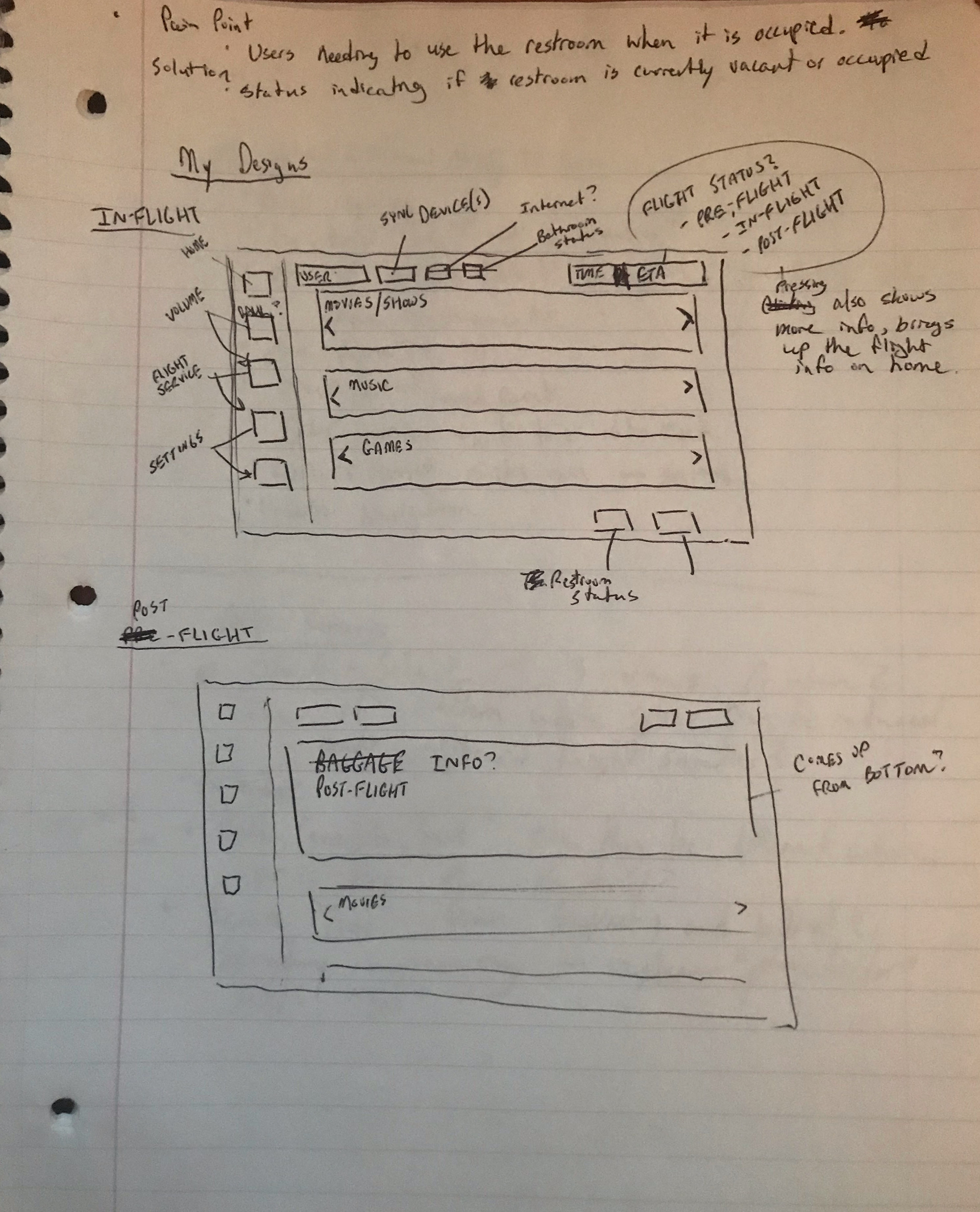
· Air travellers using in-flight entertainment devices want to find what they want fast. This display allows the user to personalize their experience. Either before or during the flgiht, a user can create their own account where they can sync their various entertainment platforms such as Netflix, Hulu, etc. This account would be saved for future flights with this company, enticing the user to stay with this company for future flights. In the meantime, users can continue to personalize their accounts via the company’s website. Immediately to the right of the display’s prioritized Navigation, the User icon that can be used for signing into their account and personalizing their experience can be found in the top lefthand corner. The Home screen will update to include the user’s synced media platforms in the respective lists. It is important that all users are automatically logged out after the flight.
· Air travellers also want to use their own devices. A button to sync their various devices is right next to the User icon, as it serves as an additional way to personalize their experience.
· Another pain point of air travellers is not knowing what the next steps of their flight experience are, including post-flight. All flight information, such as shopping, menus, on-board camera views, real-time flight statistics, and even post-flight information including baggage claim information and airport maps, are always first on the Home screen display.
· Air travellers in need of the restroom often find that getting up to go only to find it being occupied is another pain point. All devices are synced with a restroom status indicator on the bottom righthand corner of the screen where it will say Vacant or Occupied. This allows the user to know when exactly the restroom is available for them at all times. If the plane has more than one restroom, then there would be more than one indicator - one for each restroom.
· The top righthand corner of the screen shows the current time, including the time zone. In order to ease the fears of anxious air travellers, immediately to the right of the current time is the current flight status (Pre-Flight, In-Flight, Post-Flight) as well as the estimated time of arrival.
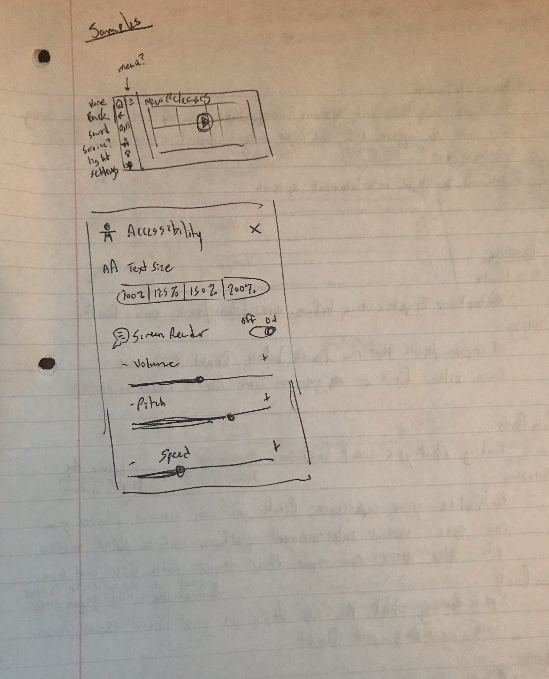
· Within the Navigation on the left includes the Home button to go to the Home screen, a Back button to go back from whatever the user is currently on, a Volume button for easily accessing the volume, a Service button for requesting the service of a flight attendant, and a Settings button for more settings. The menu provides additional information pertaining to which Navigation button was pressed. The Service menu brought up by the Service button would include service options for the user to browse through such as a dining menu, and the Settings menu would include accessibility options for users who might need them. One possible idea for the Volume or Settings option would be the ability to increase or decrease the pitch, providing laughs to kids who want to hear things in chipmunk or monster voices.
